
What is component?
Components are reusable building elements for canvas apps in PowerApps that include one or more controls. Complex capabilities can be enabled by components by utilizing sophisticated features like custom attributes.
Scenario
Assume for the moment that our application will have more than two screens and that we must display a header and footer. Therefore, in this scenario, it will be challenging to maintain the header and footer on each screen if we are not utilizing components. If we need to make any changes—for example, to the font size, title, or logo—we will have to travel through all screen windows. We may make this as a component and use it on different screens to avoid these repeating modifications.
Creating Application
Step 1: Open the Browser and pate the URL: https://make.powerapps.com/.
Step 2: Click “Apps” in the left panel.
Step 3: Click on the “New app”.

Step 4: Choose the Blank Canvas app and enter the app’s name as it appears in the image below:
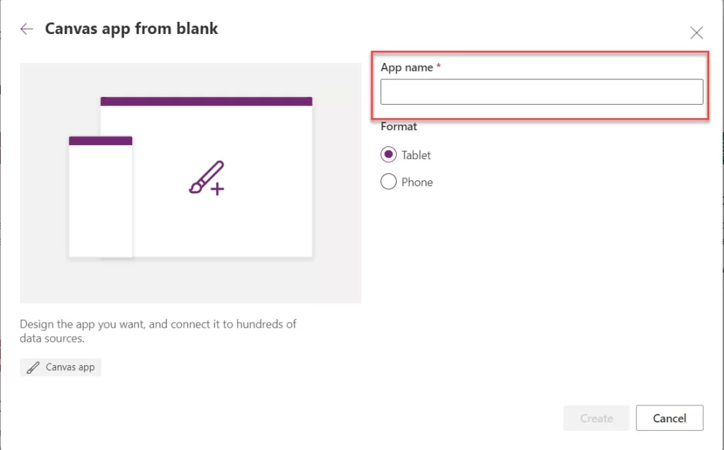
Step 5: Once the app is created, you will notice the component option is visible.
Step 6: Click on the Component tab after the screen as show into the below.
Step 7: Click on the “+ New Component” button and new component will be added to the component screen.
All the above step as show into the below image.
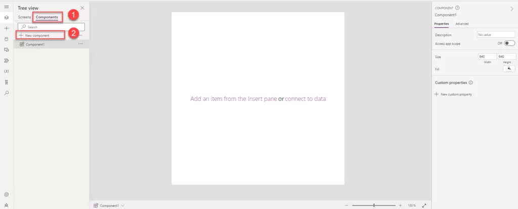
Step 8: Rename “Component1” to “Header Component” and adjust the “With” property.
Step 9: Currently, the component has a height and width of 640. To decrease the height, set it to 25, and observe the reduced component height as shown below:

Step 10: To display the screen name, you can insert a text label. If you require a home or back icon or any other elements, you can add and arrange them according to your preferences.
Step 11: For a responsive header, utilize a container control. Incorporate relevant buttons or labels into the header based on your specific requirements.
Step 12: Add a Horizontal container to your component by clicking on “Insert,” searching for the container control, and adding it.
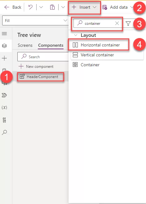
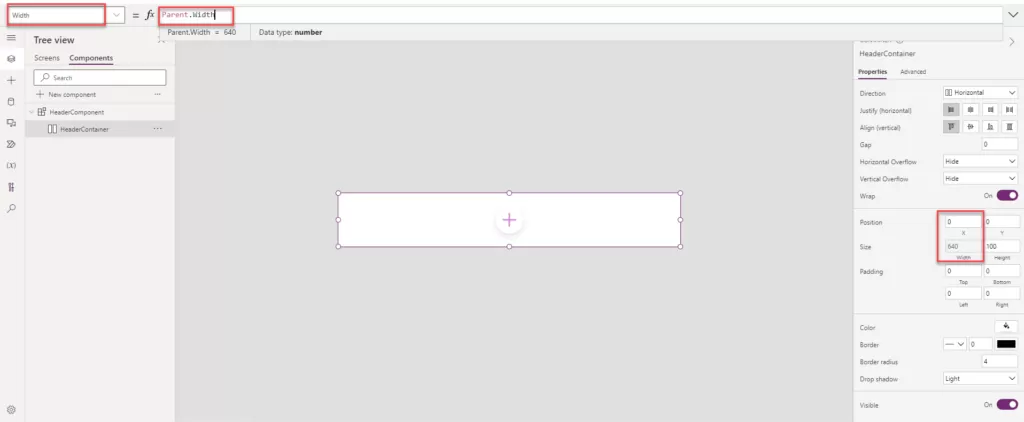
Step 13: Once you’ve added the Horizontal Container, adjust the width and X property according to your specific requirements.
- Width: Parent. Width
- X: 0
Step 14: Insert the text label and home icon inside the horizonal container. In the horizontal container all the control which are added into this container is side by side so we can easily rearrange accordingly.
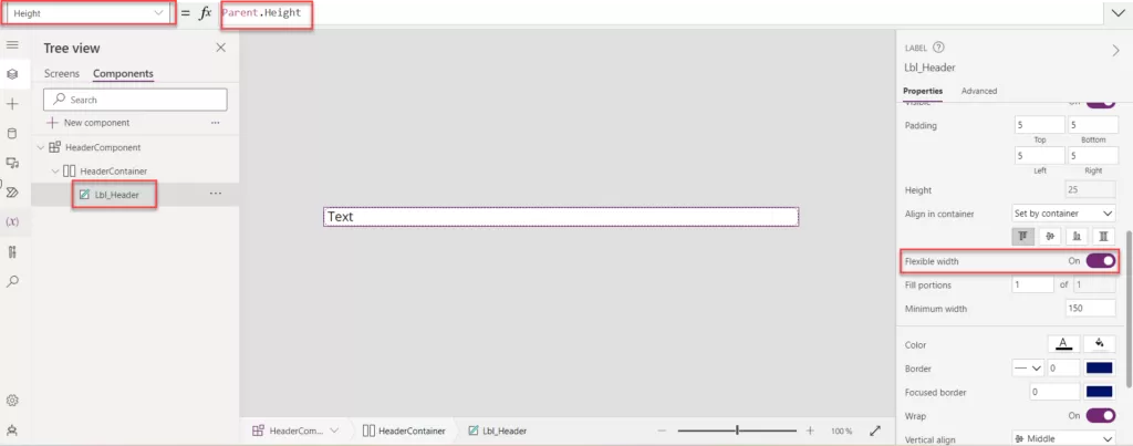
- Add the text label into the container and change the text label name to “Lbl_Header”.
- Enable the flexible width option for the Lbl_Header.
- Also change the height property set as: Parent. Width.
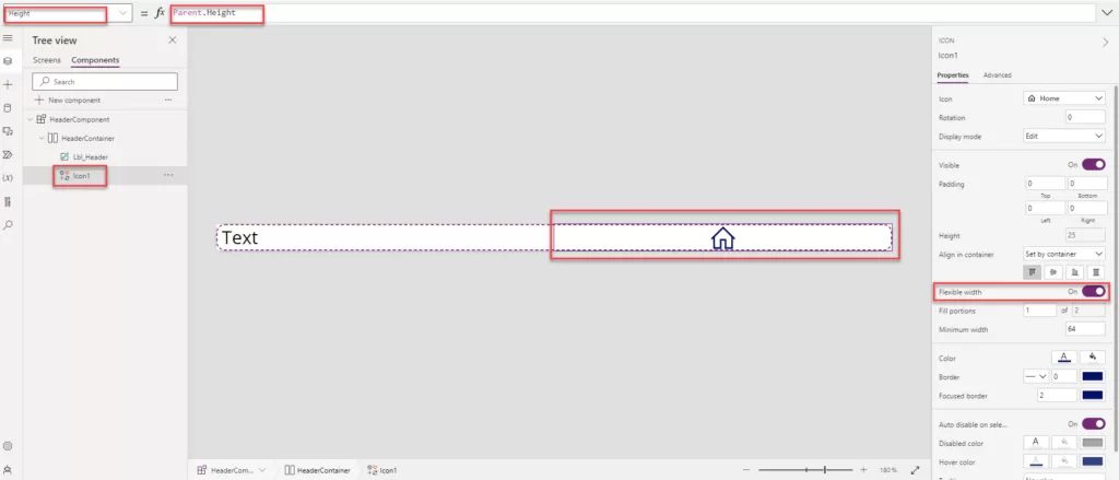
- Insert the home Icon into horizontal container.
- Enable the Flexible width to turn on.
- Ser the height: Parent. Height.
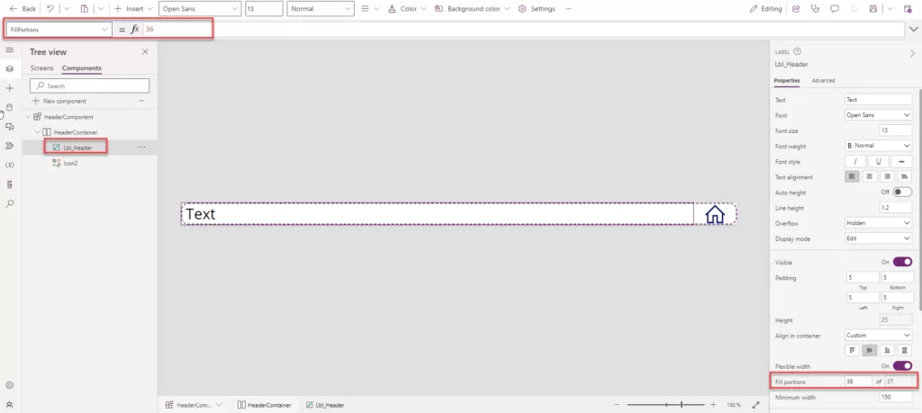
Step 15: You can select the label and adjust the “Fill Portions” based on your specific requirements.
- Fill Portions is: 36.
- Fill Portions: Defines how the individual component grows when there is more screen real-estate assigned to its parent. The number represents the portion of the extra space given to the component out of all the available extra space claimed by children of its parent. For example, if child A has Fill portions set to 1 and child B has Fill portions set to 2, child A gets 1/3 of the extra space available while child B gets 2/3 of the extra available space.
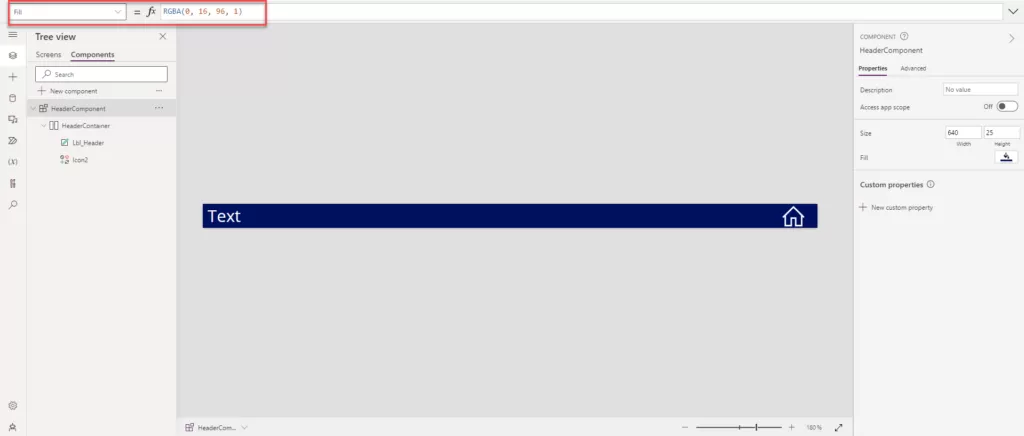
Step 16: Apply the background color to the component to set the header color. Adjust the font color for “Lbl_Header” and “Icon2” based on the background. In our case, we’ve set the text color to white, and the “HeaderComponent” background color is dark blue.
Step 17: Now that our header component is ready, we can configure the custom properties for Text, Screen, and Fill color, as displayed on the right side.
Step 18: Custom properties: A component can receive input values and emit data by creating one or more custom properties.
- In the Display name, Property name, and Description boxes, add information according to your requirements.
- Display name: Header Text
- Property name: HeaderText
Note: Ensure that you do not include spaces when providing the Property Name, as this name will be used as a reference.
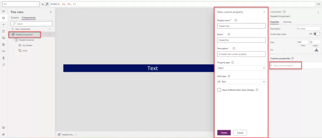
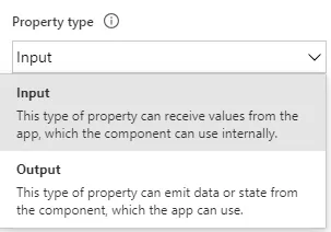
Step 19: The Property type has two options: one is called input, and the other is called output, as shown in the image below.
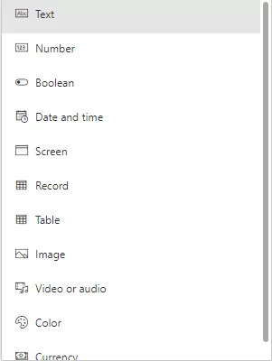
Step 20: Various types of custom properties can be created, including Text, Number, Boolean, Date and Time, Screen, Record, Table, Image, Video or Audio, Color, and Currency.
Step 21: In our case, where we need to change the screen header based on requirements, we select “Text” as the data type. Click on “Create” to add the Custom Properties.
Step 22: Add the text property of “Lbl_Header” to “HeaderComponent.HeaderText”
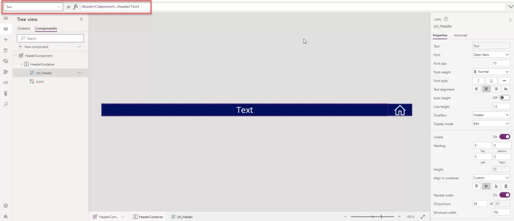
Step 23: Now, create a new property for navigating the screen.
- Click on “New Custom Property.”
- Add the Display Name: Home Icon.
- Name: HomeIcon.
- Description: A custom property for Home Icon.
- Data type: Screen.
- Click on the create button.
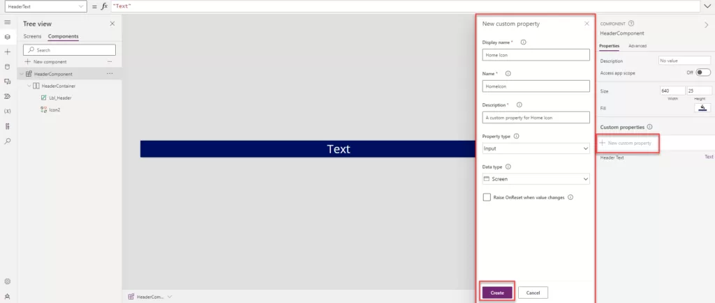
Step 24: Now, add the following formula to the icon’s “On Select” event. In our case, we want to use the Home Icon to navigate to the home screen. Select the icon and add the formula as mentioned below:
- On Select: Navigate (HeaderComponent.HomeIcon)
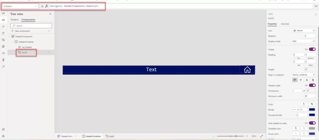
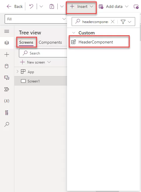
Step 25: Now, our component is ready to be added to the header of the screen in Power Apps. Click on the right side of the “Screen” option.
Step 26: Click on “Insert” and search for the component name, then add it to the screen.
Step 27: Now, set the component width and height according to the requirements on the screen. In our case, the width is set to Parent. Width, and the height is set as 30.
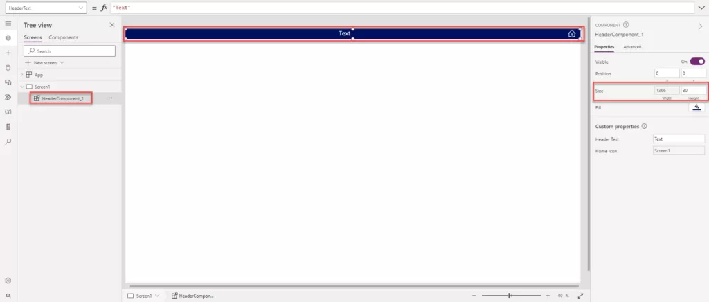
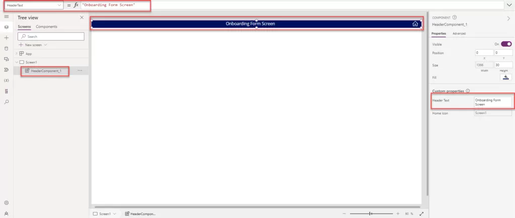
Step 28: Now, to change the header name, select the header control and go to the right side in the component Custom property.
- Click on “Header Text.”
- Provide the text you want to display as the screen header. In our case, we have added “Onboarding Form Screen” as the text.
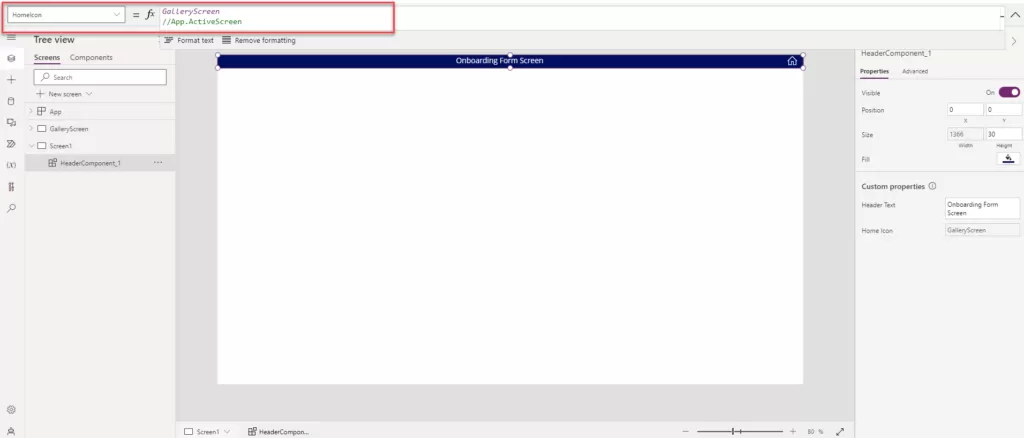
Step 29: To change the functionality of the home icon, follow the same steps as above for changing the header text. Additionally, you can add the screen name that you want to navigate to when the user clicks on the home icon. You can implement the logic in the On Select action to achieve the desired navigation.
Step 30: All the above process same as you can create the new screen and add the header component.
Want to talk?
Drop us a line. We are here to answer your questions 24*7.


