
The controls in canvas applications now come with a modern touch. These controls make it easier for creators to set up, offering a quicker and more straightforward configuration process.
At the same time, they enhance the overall experience for end-users by providing a seamless interface.
The design of these contemporary controls prioritizes accessibility, user-friendliness, and performance, resulting in visually appealing, highly functional, and easily understandable elements.
To complement these controls, there’s a newly introduced theming system that aligns with the Fluent 2 design framework. This system allows centralized adjustments to the visual appearance and atmosphere of an application.
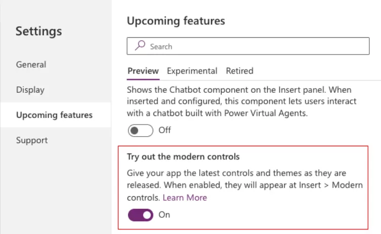
Power Apps Modern Controls are still in the preview feature, so we will have to activate it manually from the Power Apps settings.
Go to the any Power Apps Settings and click on “Upcoming features”.
Inside the “Preview” tab, toggle the switch for “Try out the modern controls” to the “On”.
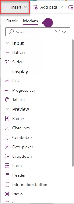
To view a list of all modern controls, navigate to the app authoring menu and choose “Insert.” From the list of controls, select “Modern”.
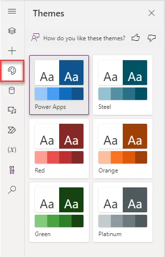
On the app authoring menu, select > Themes.
Choose one of the six default themes from the Themes pane.
- You can quickly change the visual presentation of your application by applying modern themes—pre-established collections of styles that influence the user interface. These themes follow Microsoft’s Fluent design language, adjusting various style elements like color, typography, borders, and shadows in a cohesive and aesthetically pleasing manner. This modern theming approach streamlines the customization process, allowing creators to easily design a visually harmonious and unified application.
Follows a structured approach with a predefined layout and components. Components are automatically generated based on the data model, providing a consistent user interface. It suits scenarios where data and business processes are the primary focus.
Concept: Utilizes pre-built components based on Microsoft’s Fluent design system, offering a consistent and user-friendly experience.
Data Sources: Primarily focuses on the Common Data Service, although some integrations with other sources are possible.
Automatically generates the user interface based on the underlying data model.
Tightly integrates with the Common Data Service (CDS), providing a unified and structured data source.
Suitable for scenarios where the focus is on data-driven applications with predefined entities and relationships.
Modern controls and theming are default in preview: Before the end of this year, all new apps built in make.preview.powerapps.com (and in the preview environment) have modern controls enabled by default as a control set. The opt-in setting is still part of the general tab and can be switched off if required.
Fluent icons: Makers can add standalone icons. They can also add an icon on the button.
Automatically generates the user interface based on the underlying data model.
Modern controls
Badge – A badge is a visual decoration for UI elements.
A Power Apps badge, referred to as an informational token, presents brief details like a user’s task indicator. Typically, it provides a quick way to check notifications or important messages without the necessity of reading through extensive text.
- Content: This refers to the text displayed inside the badge control.
- Content Language: It defines the audience’s language (e.g., “en-US”).
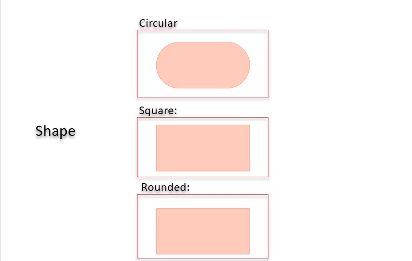
- Shape: There are three different badge shapes available, including:
Header – A control that creates a modern app header.
The Header control serves as a crucial element, streamlining the user interface design for a standard app.
With minimal setup, this control seamlessly integrates with themes utilizing modern theming and dynamic responsiveness, automatically adapting to the dimensions of the parent container or app.
It accommodates a logo and a page title and displays the user picture, all while providing various distinctive styling options.

Tabs or Tab List: Select a tab to navigate screens or take actions within the app.
The Power Apps tab list control displays a series of tabs, each representing a distinct section or page within an app. Its primary purpose is to facilitate seamless navigation between related content, allowing users to effortlessly switch between different views or modes.
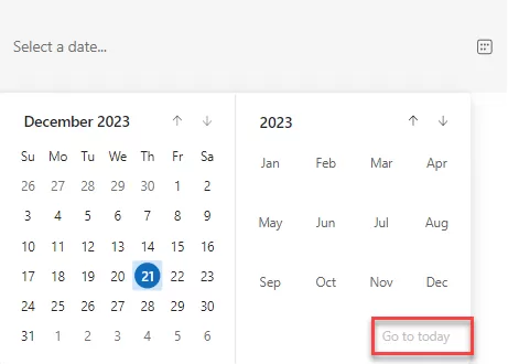
Date Picker: This new control surpasses the classic date control, offering a more user-friendly UI and improved UX. A notable feature includes the ‘go to today’ option, which is truly impressive. Navigating to any year or date is easy—simply click on the ‘go to today’ option, and it will bring you to the current date.
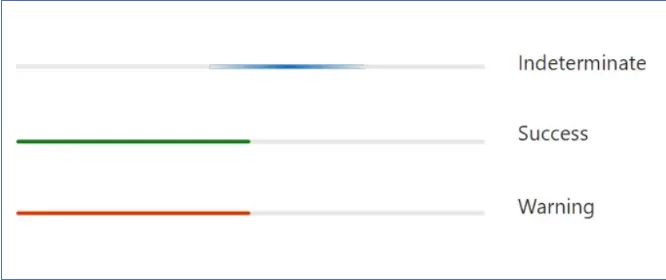
Progress Bar: This control provides options such as success, warning, and, most importantly, “Indeterminate,” where the progress bar keeps loading continuously, resembling buffering. All other properties are similar to the slider (classic control).
Conclusion: PowerApps Modern Controls represents a potent and innovative tool, empowering you to craft modern and engaging applications with enhanced features and functionalities.
Want to talk?
Drop us a line. We are here to answer your questions 24*7.


